Planning: Title design
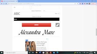
I found this cool font called Valline Wish but I do not think it will be the best fit. This font is really cool but after a lot of thought I feel like going with this font would be setting myself up for something that looks plain. I want the dramadities- I am pretty sure that is not a word. My point is I want my opening sequence to be fantastic. My titles will not be embedded onto the scene, they will be added through editing. I took a break when completing this blog because I did not know what I would use instead. I have decided Imovie was the best way to go. Through there I found a titles font named focus and I think this blends in with my opening sequence really well. For the color, I am going with white.


Comments
Post a Comment